02 Oct Get to know our Mistflower Cottages in Norton Commons.
By now, you’ve probably seen our social media about our Mistflower Cottages in Norton Commons where we debuted our current project with Cafe Appliances as well as teamed up with Laura Ashley U.S.A. As you can tell, we had the chance to design two homes. Each of these homes have the same floor plan and are virtually identical. However, you’ll notice that they have drastically different styles. Gretchen designed each space with a particular vision from the exterior details to the smaller, finishing details inside
For our first look, Gretchen went with a “modern southern classic” feel. Various shades of blues and blush pinks were used as the basic design palette intermixed with pops of chinoiserie patterns and golden brass touches. Though what you’ll see first are the accessories and furnishings, if you pay attention to the overall design, you’ll find that Gretchen had a plan for all of the selections, both permanent and interchangeable, to come together cohesively.
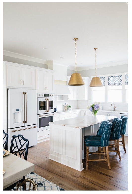
In this first house, the kitchen has a soft, yet bright, feel with tones of whites and golds. You’ll notice here the classic white subway tile and white cabinets are offset by a more dressy countertop-, a quartz option by Cambria. This particular style is Brittanicca Gold in a matte finish. The soft golden tones in the movement of the quartz really ties in the other brass finishes such as the plumbing fixtures, pendant lights and hardware throughout the space. These touches give the bright white space a warm and cozy feel that you sense in the other areas of the home.
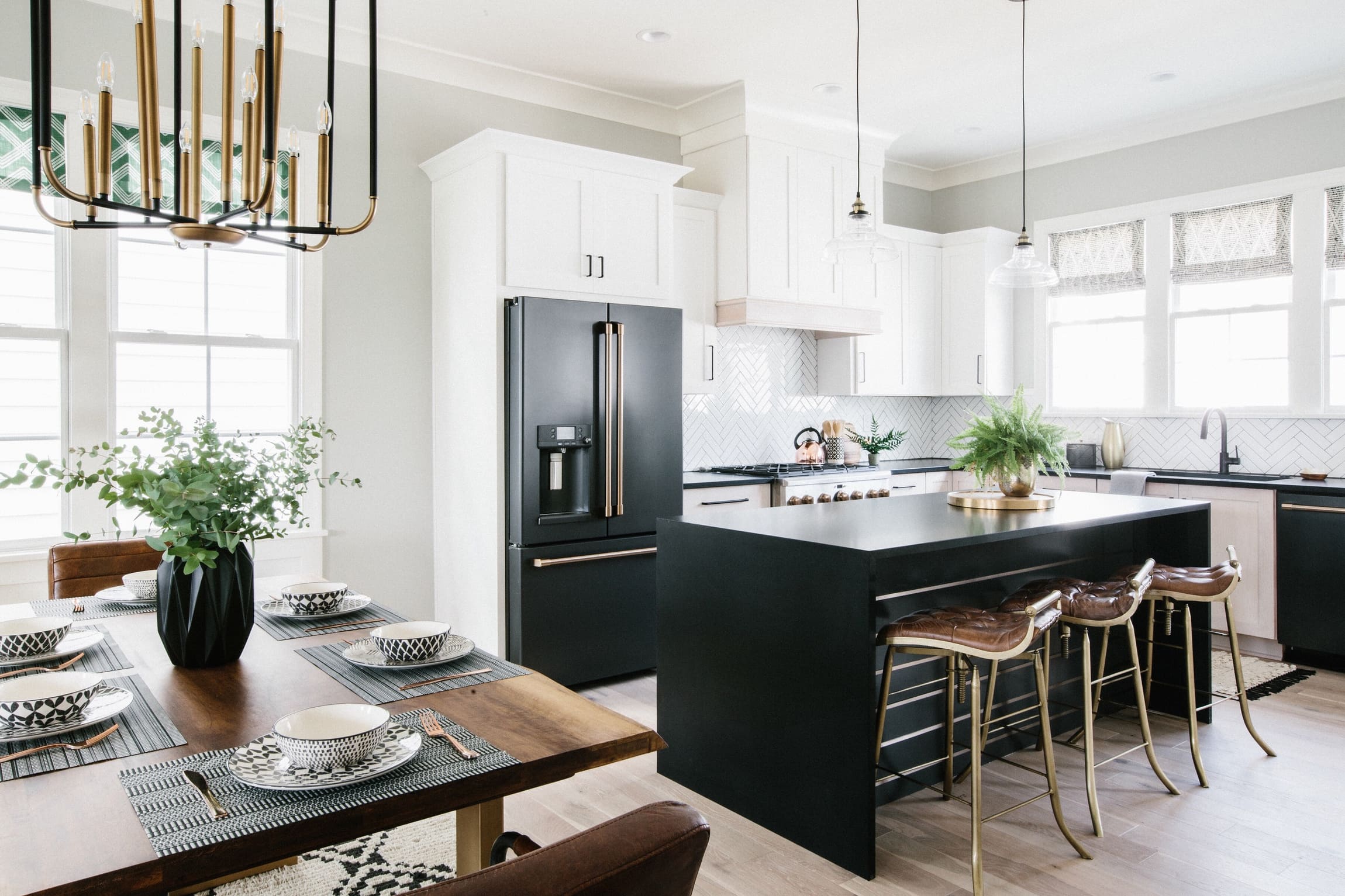
In the second home, the vibe of the space is completely different. Here, Gretchen went for a “modern boho” feel with richer, darker tones, woven textures, and pops of greens and blacks. As for this home as well, the foundation selections set the tone for the space. Opposite of the modern southern classic home, the kitchen, whilst still bright and crisp, has a matte black island to offset the white cabinets. It may seem high contrast, but it’s in the small details that Gretchen really tied everything together. The black island, with a Cambria quartz in Blackpool Matte, is pulled together by using a dark grout in the white backsplash tile- laid in a herringbone pattern which helps play up the woven texture vibe. Matte black cabinetry hardware is also used to help pull it all together cohesively.

Another place you’ll notice a striking design difference is in the fireplace details. While the modern southern classic home has a more traditional style mantle, and the modern boho home has a more contemporary mantle style, there is an element of fun given off by the surrounding tile of each. Each home features a Laura Ashley tile design, both found at The Tile Shop. In the modern southern classic home, the tile design is slightly contemporary, giving the traditional mantel a more updated feel. The soft grey hue of the tile blends well with the surrounding white. 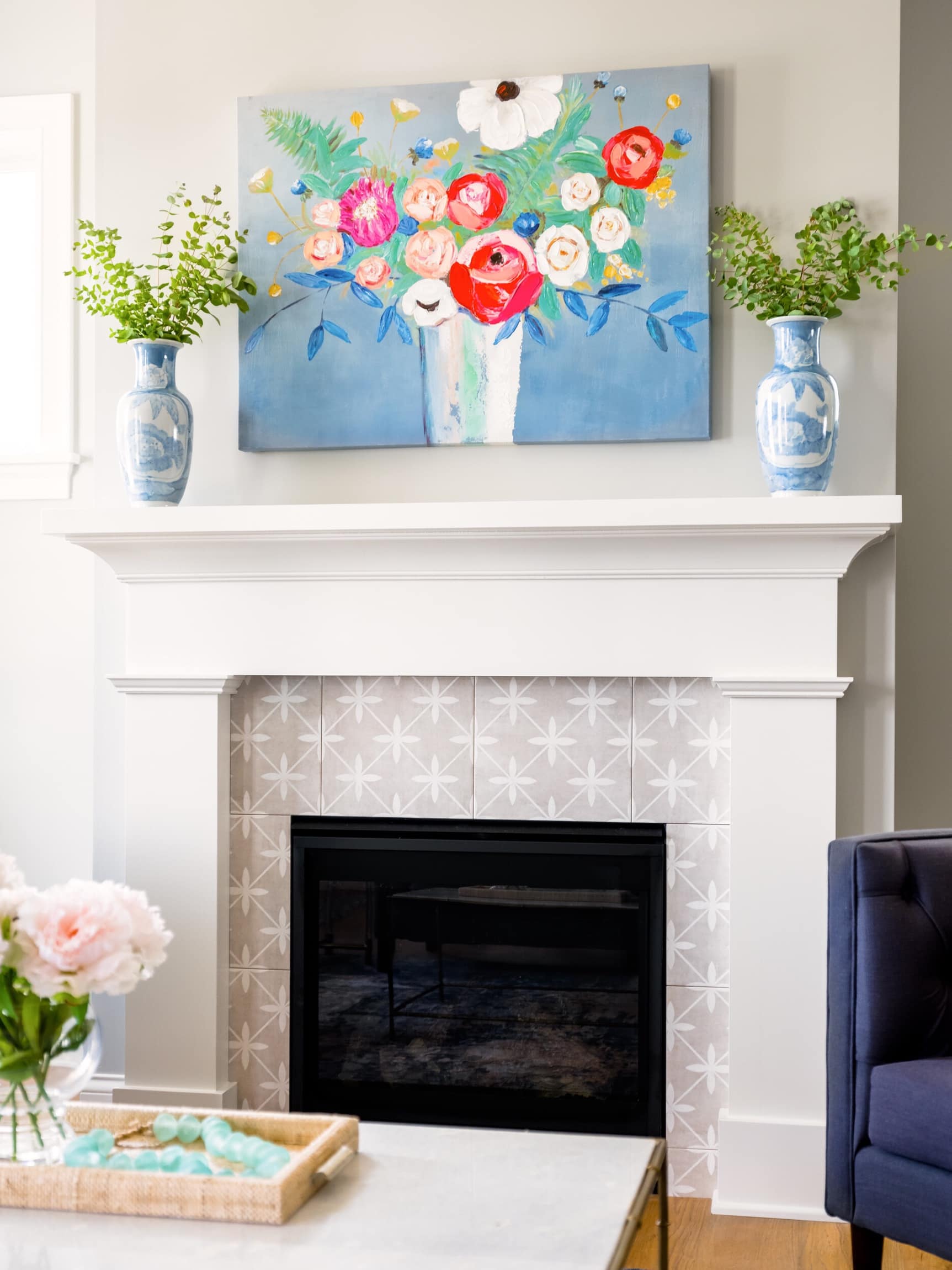 On the contrary, the modern boho house has a much more bold tile to offset the sleek, black mantle design. Here, the tile is a charcoal and white geometric pattern.
 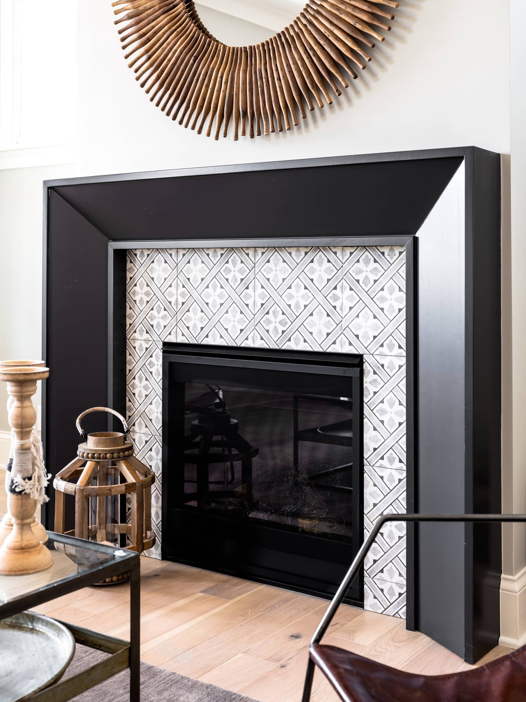 In each home, you’ll notice that the colors in the tile play off both the mantle and the wall color of each room. It’s in these small details that Gretchen really pulls all of the materials and finishes together in subtle, yet intentional way.
Written by Ali Hicks